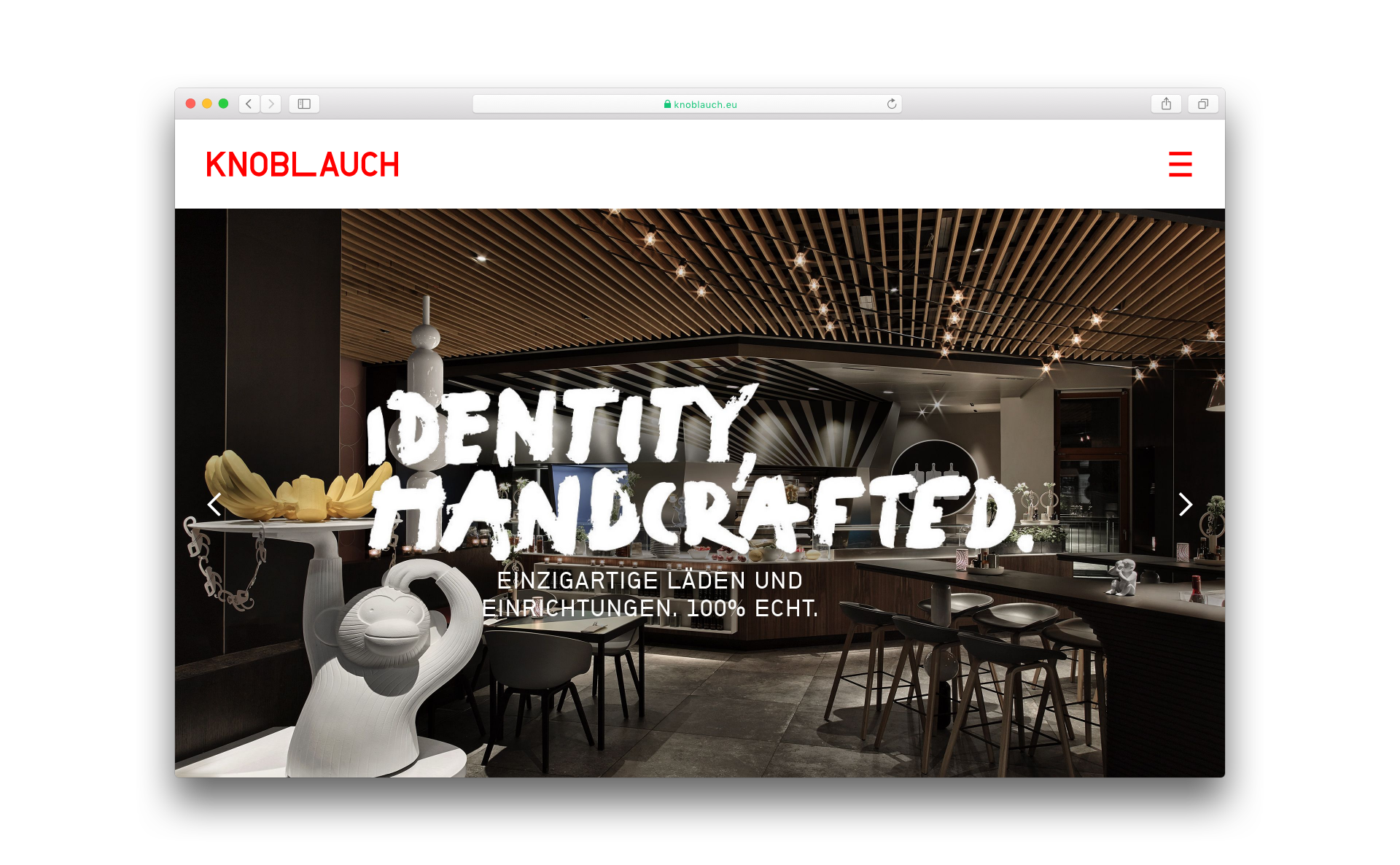
In Fall 2015 I started to work on a redesign of the website for interior and shop specialists KNOBLAUCH with my dear friends at ARTHELPS. The site evolved since then and continues to receive little updates from time to time.
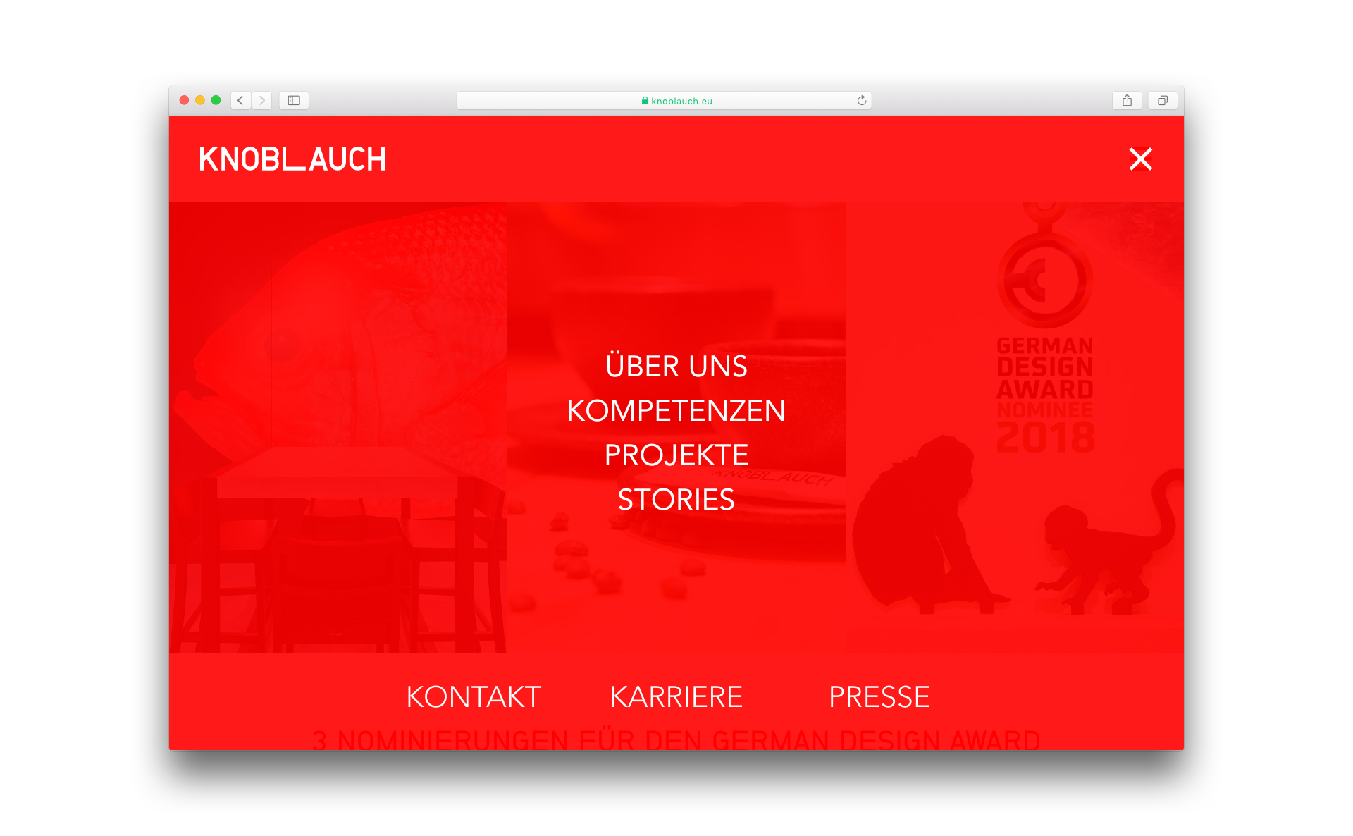
The task was pretty simple and straightforward: Bring the brand and it's presence into the present by creating a responsive home on the web and emphasize it's strong identity.

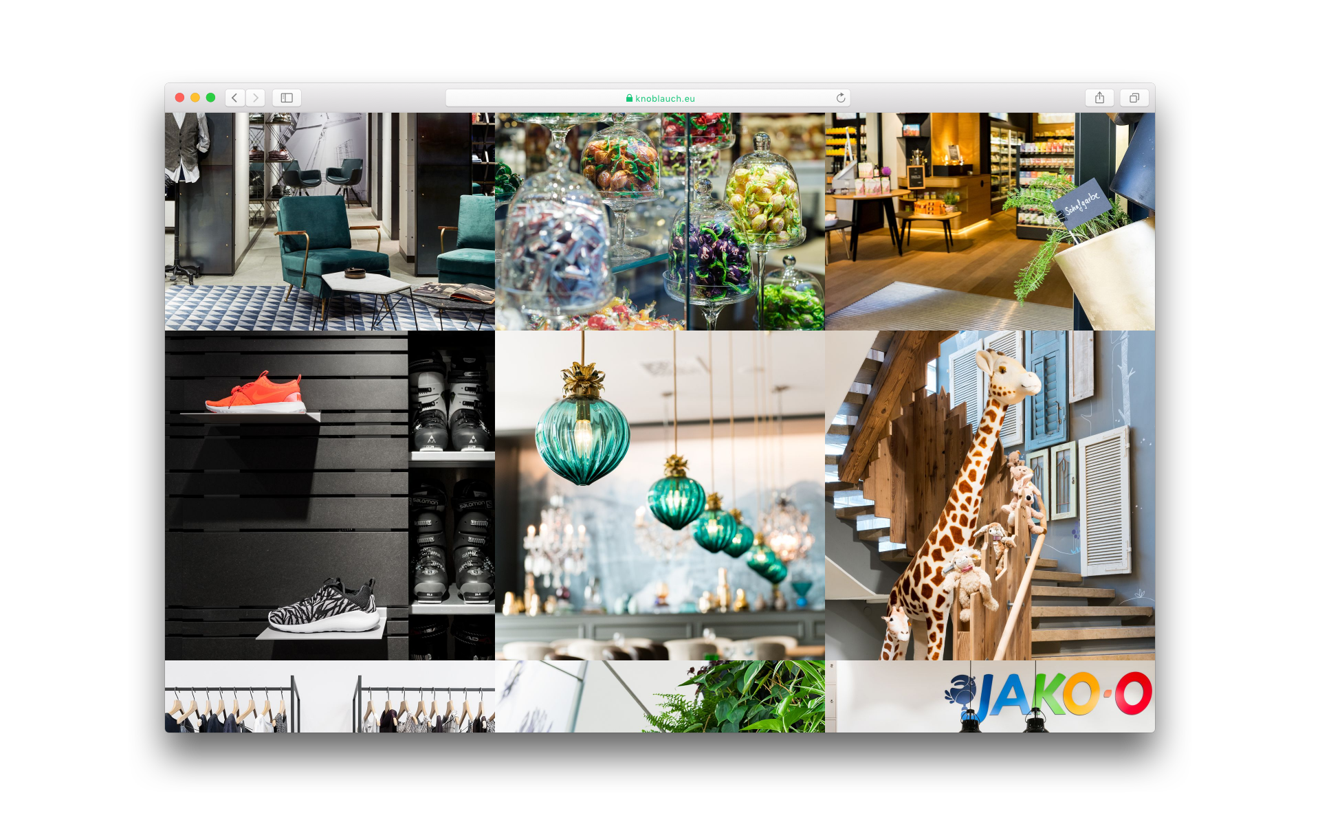
Derived from it's sharp cornered and prolonged L in the logotype is a squared structure and grid with bold and big photography and content sections. The website should support the amazing shop and interior design projects KNOBLAUCH is known and famous for.
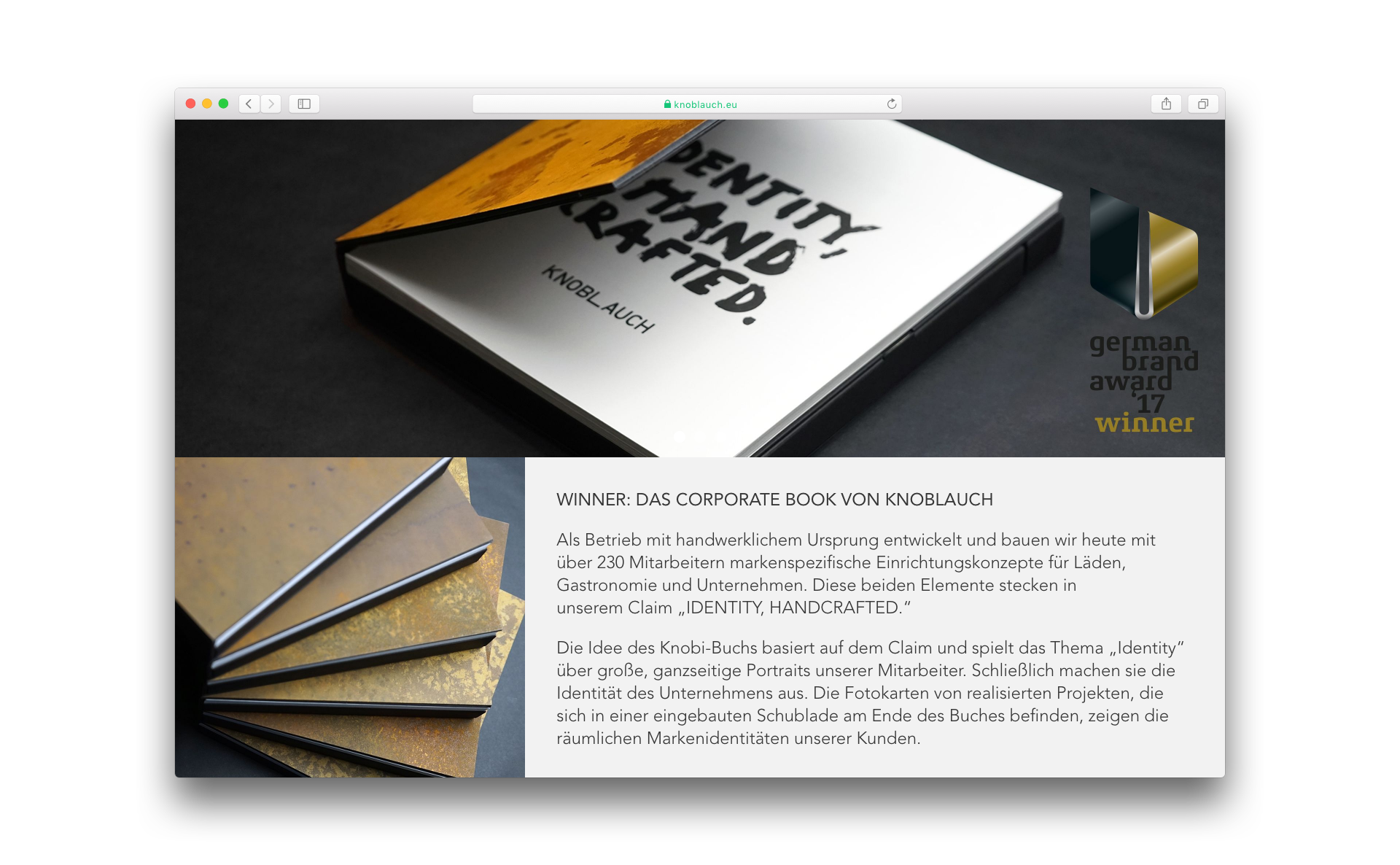
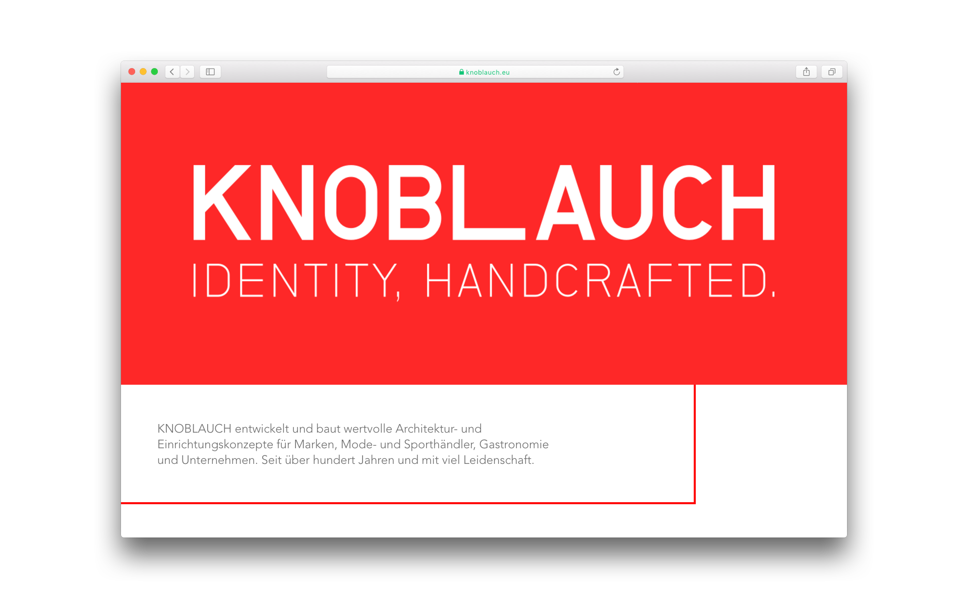
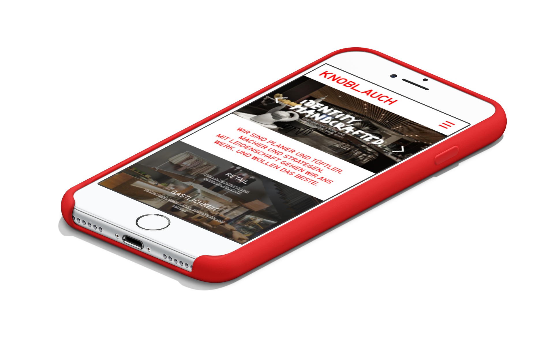
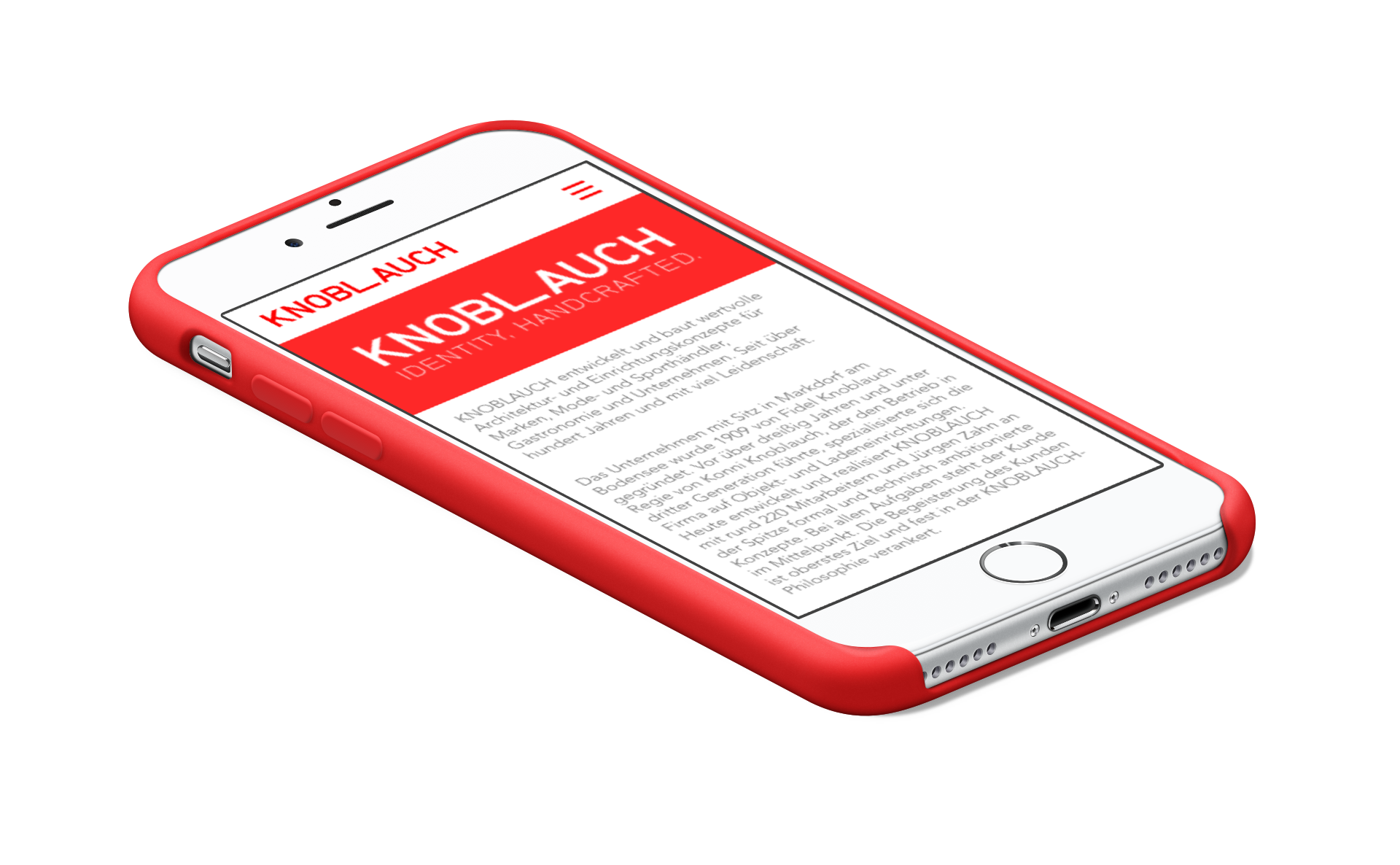
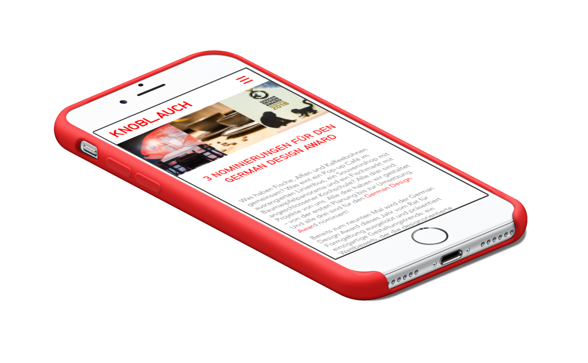
Of course, when viewed on Mobile you recognize the same grid pattern in different stacks which allows for a quick glance at the company and its projects on the go.
Thanks to the folks from ARTHELPS for this challenge and Marcel Berger from doolab for the ace development of the website.